Your closet is full, yet somehow you have nothing to wear. You reach for a top, hold it against three different bottoms, and put all of them back. It isn’t that you own too little. It’s that your clothes were never chosen to speak the same language, so they refuse to work together.
That shared language is a capsule wardrobe color palette: a small, deliberate set of colors that every piece is picked to fit within. When your wardrobe follows one palette, almost everything mixes with everything else, and a modest closet of 30 to 40 pieces suddenly produces far more outfits than its size suggests. Getting dressed stops being a daily negotiation and starts feeling effortless.
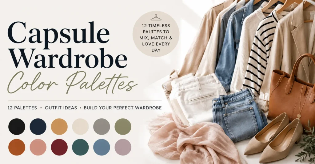
This article gives you everything you need to build that palette from scratch. You’ll get 12 ready-to-copy palettes with hex codes, a simple three-test method to find the colors that actually flatter you, real outfit combinations from a single palette, and a five-step process to design your own around the clothes you already love.
Want the swatches right away? Jump to the 12 palettes. Otherwise, start here, and you’ll never second-guess a color choice again.
What Is a Capsule Wardrobe Color Palette?
A capsule wardrobe color palette is a small, intentional group of colors, usually five to nine shades, that every piece in your wardrobe is chosen to fit within.
Because the colors are selected to work together, any top can pair with any bottom, and any jacket can layer over any outfit, without clashing.
Think of it as the rulebook your closet follows. Instead of buying whatever looks good on the hanger, you buy within your palette, which means new pieces slot straight into outfits you already own rather than becoming orphans that match nothing.
Color is worth deciding first because it’s the foundation everything else sits on. You can own the perfect trousers, but if they’re a shade that fights the rest of your closet, they’ll stay unworn.
Most stylists lean on a loose 60/30/10 balance, roughly 60% neutrals, 30% main colors, and 10% accents in any given outfit, which keeps looks grounded while still leaving room for personality.
If you’re only just starting out, it helps to read what a capsule wardrobe actually is and how to build one step by step alongside this guide, since your palette and your piece count are decided together.
The Anatomy of a Palette: Neutrals, Mains and Accents
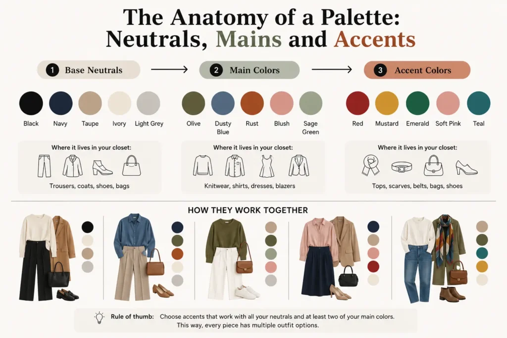
Every functional palette breaks down into three jobs. Once you can see which color is doing which job, choosing shades stops feeling like guesswork.
| Role | What it does | Typical shades | Where it lives in your closet |
| Base neutrals | Anchor almost every outfit | Black, navy, charcoal, camel, beige, ivory | Trousers, coats, shoes, bags |
| Main colors | Your everyday color identity | Olive, navy, dusty blue, blush, mushroom | Knitwear, shirts, dresses, blazers |
| Accents | Add personality in small doses | Red, mustard, emerald, soft pink | Tops, scarves, belts, statement shoes |
Base Neutrals: Your Foundation
Neutrals are the shades that go with everything and never demand attention. They’re the workhorses: the trousers, the coat, the boots you reach for four days out of five.
Because they carry the heaviest pieces in your wardrobe, they deserve the most thought. If nearly all your bottoms are already black and your favorite coat is black too, your closet has effectively voted; black is your base whether you planned it or not.
Pick two to three neutrals you genuinely wear, not the ones you think you should wear. Common anchors are black, navy, charcoal, camel, taupe, and ivory.
Main Colors: Your Everyday Identity
Main colors are the shades you love and reach for often, but that carry a little more character than a pure neutral. These might be a soft olive, a dusty blue, a warm rust, or a muted blush: colors you’d happily wear in a sweater, a shirt, or a dress several times a week. They’re what make your palette feel like you rather than a generic minimalist template.
The test for a main color is honesty: would you actually wear it in a substantial piece, repeatedly? If the answer is “only for a special occasion,” it belongs in accents, not mains.
Accent Colors: Your Personality
Accents are the fun part: the bolder or brighter shades you enjoy but don’t need every day. A cherry red, a mustard, an emerald, a blush pink. They work best in smaller items: a scarf, a knit, a bag, a pair of shoes.
The rule that keeps accents from wrecking a palette is simple. Every accent should pair with all your neutrals and at least two of your main colors. That way a single red sweater plugs into five outfits instead of demanding new pieces to support it.
How Many Colors Do You Actually Need?
Fewer than you’d think. A reliable formula for most people is three to four neutrals, two to three main colors, and one to two accents, which comes to around six to nine shades total. That’s enough to generate dozens of distinct outfits without the palette becoming so wide that things stop mixing.
If getting dressed still feels like effort, the usual culprit isn’t too few clothes. It’s too many colors that don’t relate to each other.
12 Capsule Wardrobe Color Palettes (With Hex Codes)
Here are twelve complete palettes you can copy directly. Each one is built to be internally mixable, so neutrals anchor, mains carry, and accents lift.
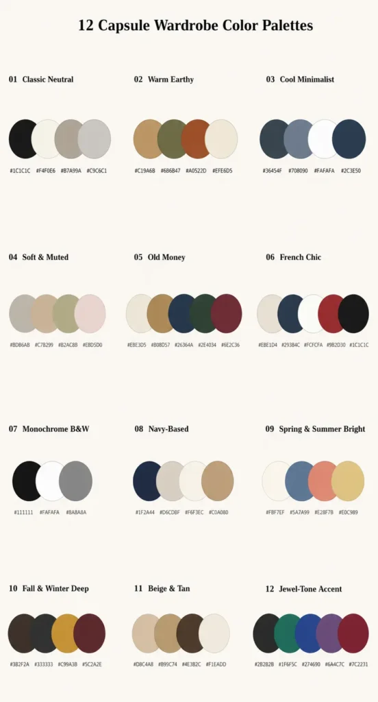
Use the hex codes as a shopping reference so you can match shades when buying online. Pick the one that matches your coloring and the mood you want, then adapt it over time.
1. Classic Neutral
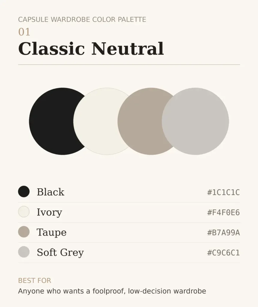
The safest, most versatile starting point, and the palette that never dates.
#1C1C1C Black
#F4F0E6 Ivory
#B7A99A Taupe
#C9C6C1 Soft Grey
Best for: anyone who wants a foolproof, low-decision wardrobe.
2. Warm Earthy
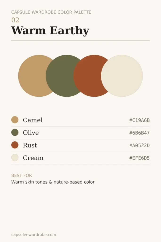
Grounded, autumnal, and quietly rich. Flatters warm undertones beautifully.
#C19A6B Camel
#6B6B47 Olive
#A0522D Rust
#EFE6D5 Cream
Best for: warm skin tones and anyone drawn to nature-based color.
3. Cool Minimalist
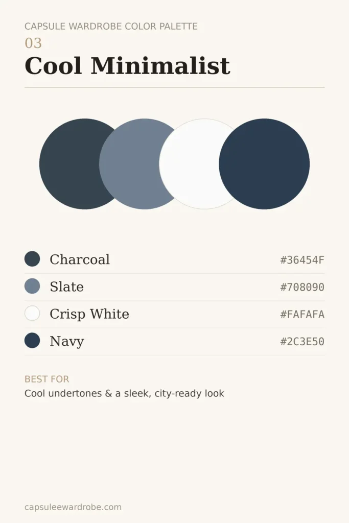
Sharp, clean, and modern. A palette that reads as understated and polished.
#36454F Charcoal
#708090 Slate
#FAFAFA Crisp White
#2C3E50 Navy
Best for: cool undertones and a sleek, city-ready look.
4. Soft and Muted
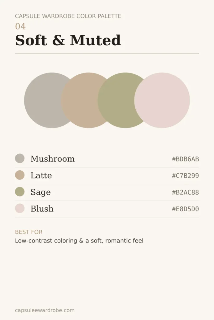
Gentle, low-contrast, and calming. Nothing shouts; everything blends.
#BDB6AB Mushroom
#C7B299 Latte
#B2AC88 Sage
#E8D5D0 Blush
Best for: low-contrast coloring and a soft, romantic aesthetic.
5. Old Money / Quiet Luxury

Understated wealth without a single logo: deep, refined, and timeless.
#EBE3D5 Cream
#B08D57 Camel
#26364A Navy
#2E4034 Forest
#6E2C36 Burgundy
Best for: the elevated, heritage look. Pairs perfectly with an old money capsule wardrobe.
6. French Chic
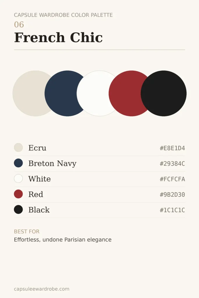
Effortless Parisian dressing: mostly neutral with one sharp pop.
#E8E1D4 Ecru
#29384C Breton Navy
#FCFCFA White
#9B2D30 Red
#1C1C1C Black
Best for: easy, undone elegance. See the full French capsule wardrobe.
7. Monochrome Black and White
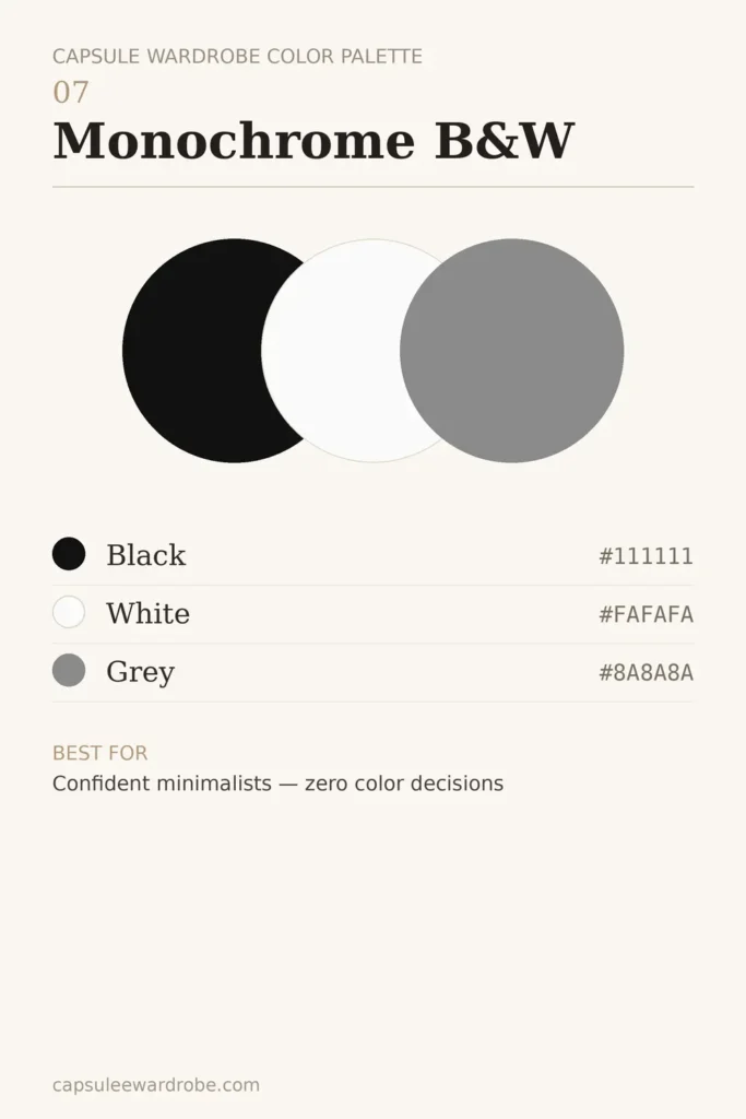
The ultimate no-fuss palette. Bold in its simplicity, impossible to get wrong.
#111111 Black
#FAFAFA White
#8A8A8A Grey
Best for: confident minimalists who want zero color decisions.
8. Navy-Based
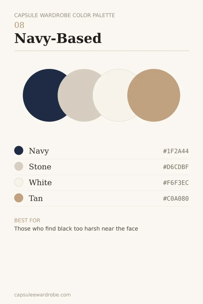
Navy does everything black does but feels a touch softer and more approachable.
#1F2A44 Navy
#D6CDBF Stone
#F6F3EC White
#C0A080 Tan
Best for: those who find black too harsh near the face.
9. Spring and Summer Bright
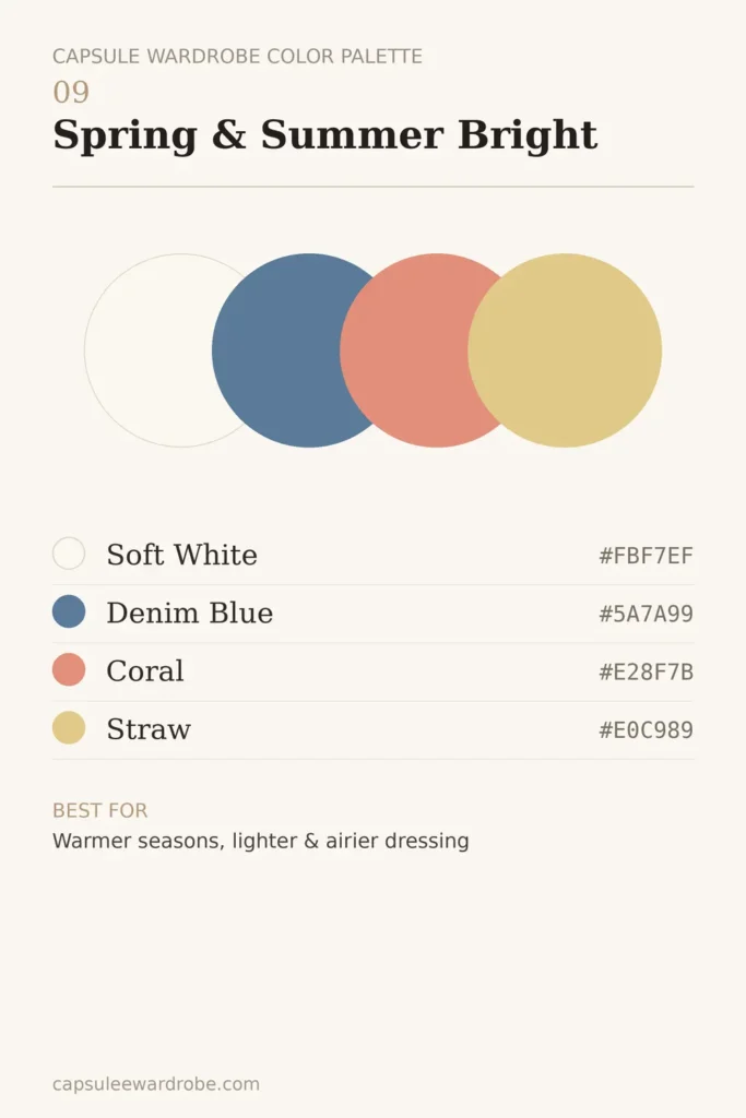
Lighter, airier shades for warm months without abandoning cohesion.
#FBF7EF Soft White
#5A7A99 Denim Blue
#E28F7B Coral
#E0C989 Straw
Best for: warmer seasons and lighter, airier dressing.
10. Fall and Winter Deep
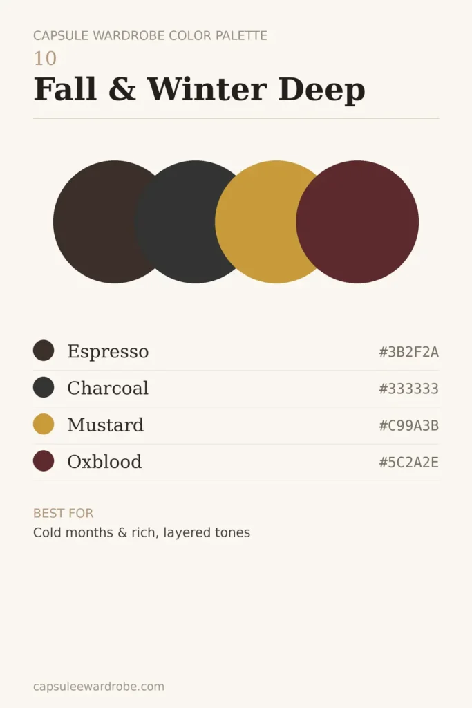
Richer, heavier tones that suit layering and colder light.
#3B2F2A Espresso
#333333 Charcoal
#C99A3B Mustard
#5C2A2E Oxblood
Best for: cold months and rich, layered tones.
11. Beige and Tan Warm Neutral
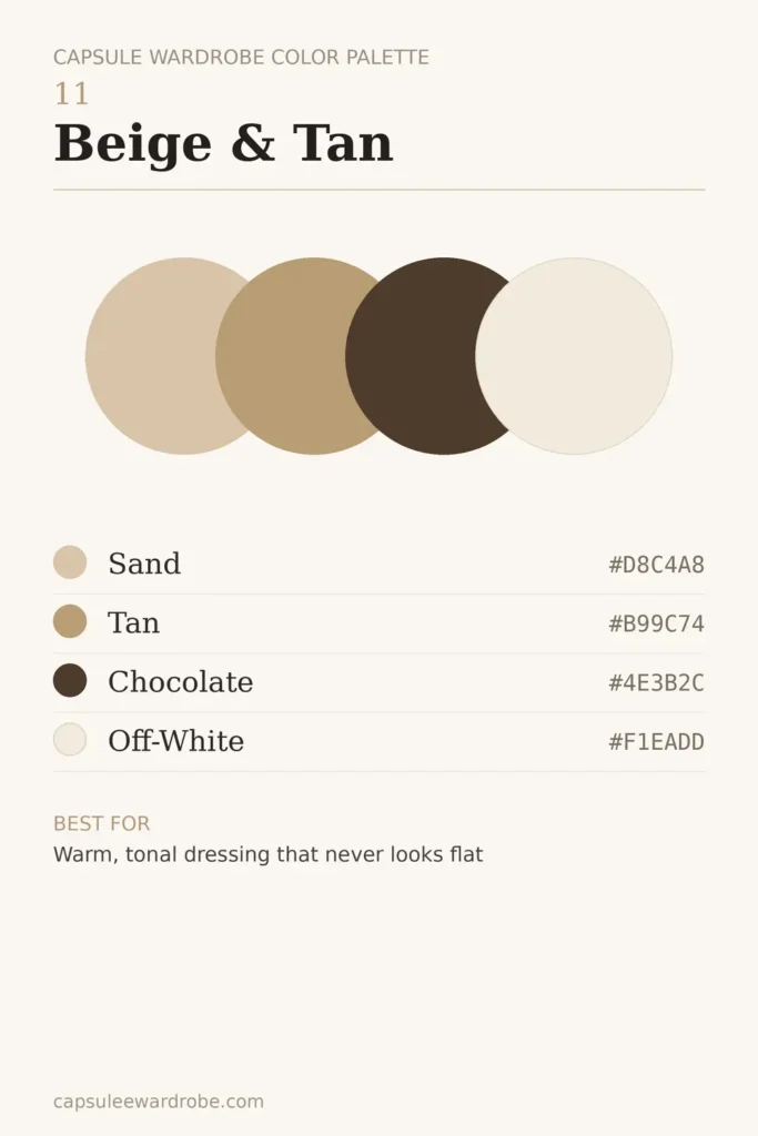
An all-neutral palette with enough depth that it never looks flat.
#D8C4A8 Sand
#B99C74 Tan
#4E3B2C Chocolate
#F1EADD Off-White
Best for: warm, tonal dressing and a soft, expensive-looking closet.
12. Jewel-Tone Accent
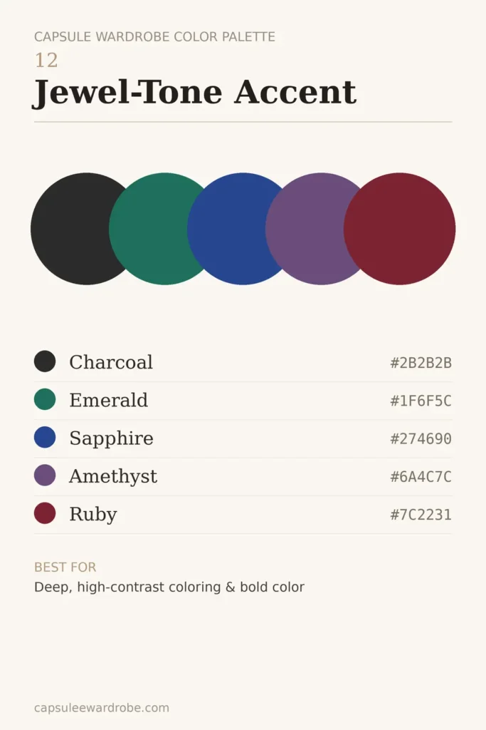
Neutral base, saturated payoff, for those who want real color without chaos.
#2B2B2B Charcoal base
#1F6F5C Emerald
#274690 Sapphire
#6A4C7C Amethyst
#7C2231 Ruby
Best for: deep, high-contrast coloring and lovers of bold color used deliberately.
Choose Colors That Flatter You: Undertone and Skin Tone Guide
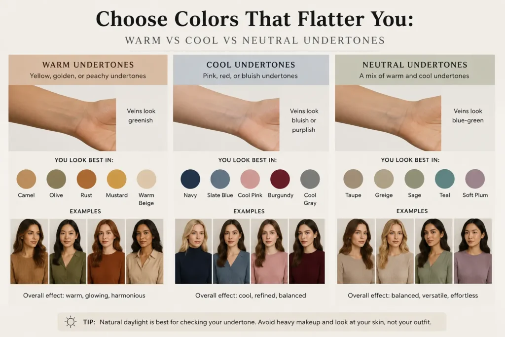
A palette can be gorgeous on a mood board and still wash you out in the mirror. The fix is matching your colors to your natural coloring, and the single most useful lever there is your undertone.
How to Find Your Undertone
You don’t need a professional analysis to get close. Try these three quick checks in natural daylight:
- The vein test. Look at the veins on your inner wrist. Blue or purple leans cool; green leans warm; a mix of both suggests neutral.
- The jewelry test. Hold gold near your face, then silver. Gold flattering you points to warm; silver to cool; both working equally is neutral.
- The white vs. ivory test. Hold a pure bright white next to your face, then a warm ivory. If bright white makes you look fresh, you’re likely cool; if ivory is more flattering, you’re likely warm.
Run all three. When they agree, you have your answer. When they split, you’re probably neutral, which is good news, because you can wear almost anything.
Best Palette for Warm Undertones
Warm skin comes alive in golden, earthy shades. Lean on camel, olive, rust, cream, warm brown, and mustard.
Avoid icy pastels and stark black-and-white pairings, which can look severe against warm skin. Palettes 2 (Warm Earthy) and 11 (Beige and Tan) above are natural fits.
Best Palette for Cool Undertones
Cool skin is flattered by blue-based hues: charcoal, navy, slate, true white, soft pink, and jewel tones like sapphire and emerald. Crisp white works better on you than ivory. Palettes 3 (Cool Minimalist) and 12 (Jewel-Tone) are built for you.
Best Palette for Neutral Undertones
Neutral undertones are the most flexible, so you can borrow from both warm and cool families. Your best strategy is to pick based on the mood you want rather than on flattery alone, since most colors will read well on you. Palettes 1 (Classic Neutral) and 4 (Soft and Muted) are easy wins.
A Quick Note on Seasonal Color Analysis
You may have heard of seasonal color analysis, the Spring/Summer/Autumn/Winter system that sorts people into detailed palettes based on undertone, depth, and contrast.
It’s genuinely useful, but you don’t need to book a session before building a capsule. Treat it as a refinement later, not a prerequisite now. Undertone alone will get you 80% of the way there.
How to Build Your Own Palette From Your Existing Closet (5 Steps)
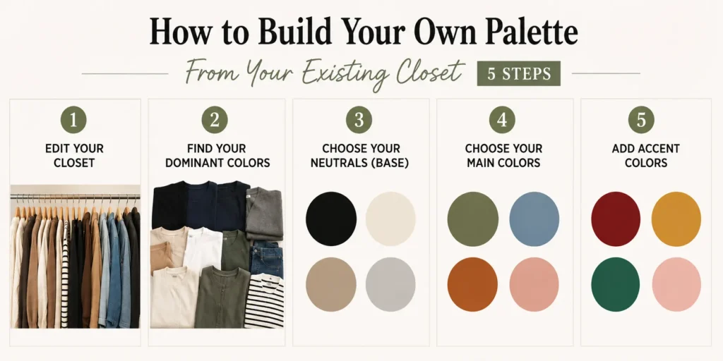
The most reliable palette isn’t invented on paper; it’s discovered in the clothes you already reach for. Colors that look stunning in theory often sit unworn in reality. Here’s how to build one grounded in real life.
Step 1: Clear The Noise First
Before you analyze anything, pull out the pieces you no longer wear. Deciding a palette around clothes you’ve already outgrown gives you a distorted answer.
If you haven’t done a proper edit yet, work through the capsule wardrobe checklist first.
Step 2: Find Your Top Three Worn Colors
Look at what’s actually in heavy rotation. Don’t sort them into “colors” versus “neutrals” yet; just note the three or four shades that appear most. This is your closet telling you the truth about what you wear.
Step 3: Lock In Your Base Neutral
Choose the neutral that already dominates your bottoms, outerwear, and shoes. This single decision simplifies everything downstream, because your shoes and bags only need to work with one anchor.
Step 4: Add Supporting Neutrals And Mains
Layer in one or two more neutrals for versatility, then two or three main colors you love wearing in real pieces, not aspirational ones. Bridge shades like grey, stone, and light blue help connect darker bases to lighter accents.
Step 5: Test For Mixability, Then Shop The Gaps
Before finalizing, do a quick mental check: does every main color pair with each neutral and at least two accents? If yes, you have a working palette.
Now the palette becomes a filter, so off-palette pieces become automatic no’s, and you can direct your budget toward the gaps that unlock the most outfits.
Color Combinations: What Actually Goes Together
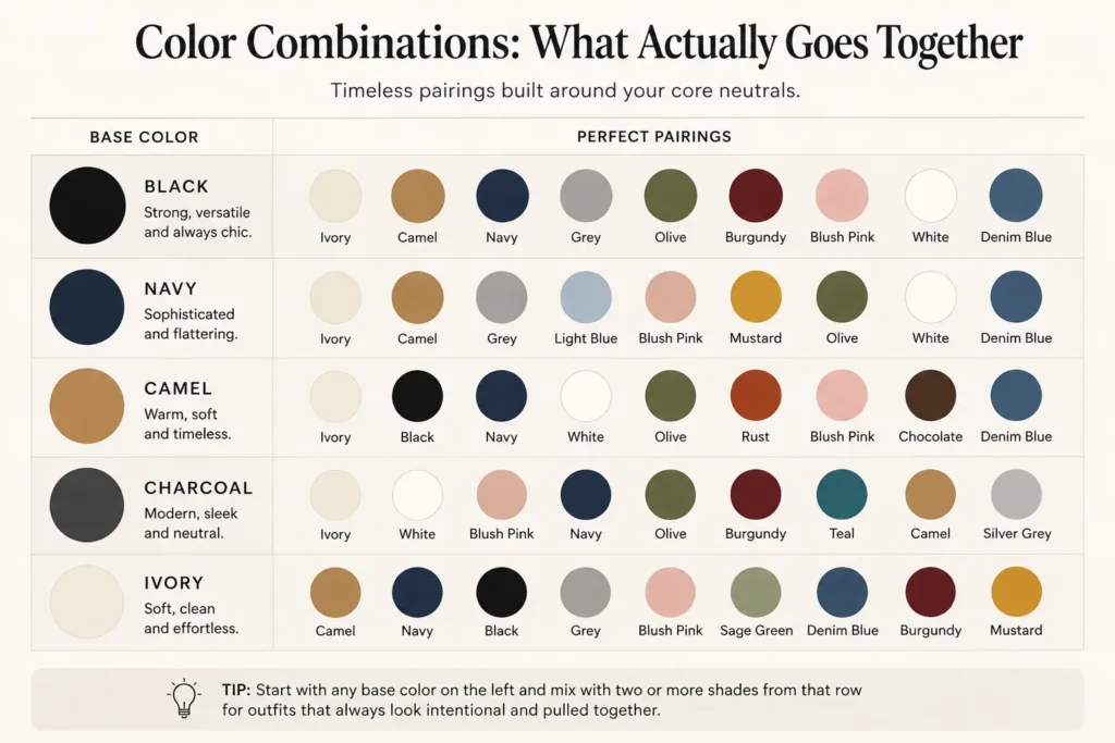
Knowing your colors is one thing; knowing which pairings sing is another. Here’s a quick reference for combining shades within a capsule. Treat neutrals as the constant and rotate mains and accents against them.
| Neutral base | Reliable main pairings | Accent that pops |
| Black | Grey, white, camel | Red, emerald |
| Navy | Stone, tan, white | Blush, mustard |
| Camel | Cream, olive, chocolate | Oxblood, forest |
| Charcoal | Slate, ivory, sage | Sapphire, rust |
| Ivory / Cream | Taupe, camel, navy | Terracotta, soft pink |
The underlying principle: pair within the same temperature family for harmony, and let a single accent do the talking. When two colors refuse to work together, the issue is usually depth or saturation, not the hue itself. A muted, dustier version of the same color will often slot right in.
See It in Action: 6 Outfits From One Palette
Here’s the proof that a small palette isn’t limiting. Take the Classic Neutral palette (black, ivory, taupe, soft grey) and watch how many looks it produces:
- Everyday errands: Black trousers + ivory knit + taupe coat + white sneakers.
- Work-ready: Taupe tailored trousers + ivory shirt + black blazer + loafers.
- Relaxed weekend: Black jeans + soft grey sweater + ivory scarf + ankle boots.
- Dinner out: Black slip skirt + ivory knit tucked in + taupe trench + heeled mules.
- Layered winter: Taupe roll-neck + black trousers + grey wool coat + black boots.
- Smart travel: Black straight-leg trousers + ivory tee + taupe cardigan + white trainers.
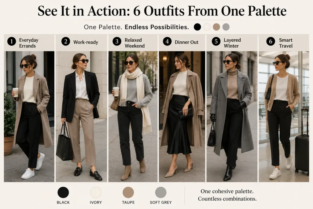
Six distinct outfits from four colors and a handful of pieces, with no clashing and no decision fatigue. That’s the entire promise of a capsule palette working in real time.
Adapting Your Palette Across Seasons (Without Starting Over)
A common misconception is that each season needs a brand-new palette. It doesn’t. Your core palette stays the same year-round; what changes is the weight and proportion of the colors.
In spring and summer, you lean into the lighter members of your palette and swap in airier fabrics: more ivory, more soft tones, lighter linens and cottons.
In fall and winter, you shift toward the deeper end, with more black, espresso, and taupe in heavier knits, wool, and outerwear. The colors are consistent; only the texture and the balance move.
This is exactly why a capsule works long term rather than needing a full refresh every few months. If you want season-specific breakdowns, the spring, summer, fall, and winter capsule guides show how to apply this shift.
5 Common Capsule Wardrobe Color Mistakes to Avoid
Even careful planners fall into a few predictable traps. Watch for these:
- Too many neutrals. A closet that’s all black, grey, and beige can feel flat and joyless. Neutrals are the foundation, not the whole house, so leave room for a main color or two.
- Mixing warm and cool tones by accident. A warm camel and a cool grey can quietly fight each other. Decide on a dominant temperature and let your palette lean that way.
- Over-relying on accents. Accents are seasoning. When half your closet is “statement” pieces, nothing stands out and everything competes.
- Buying pieces that almost match. The near-miss shade is the enemy of a capsule. If a color only sort-of works with your palette, it’ll sit unworn. Match deliberately.
- Choosing aspirational colors you never wear. This is the most expensive mistake. The gorgeous mustard or blush you wish you wore usually stays on the hanger. Build around what you actually reach for, and keep aspiration confined to one low-risk accent.
Free Printable Capsule Wardrobe Color Palette Worksheet
Want to lock in your own palette? Grab the free printable worksheet. It walks you through your base neutrals, main colors, and accents in one page, with space to note hex codes and swatches so you have a shopping reference on your phone.
You don’t need to memorize anything; you just need one clean, saved palette you can check against before you buy.
Download capsule-wardrobe-color-palette-worksheet — print it, fill it in, and never second-guess a color again.
Bringing It All Together
A capsule wardrobe color palette isn’t about restriction; it’s about removing friction. When your closet speaks one color language, getting dressed stops being a negotiation and every new purchase earns its place.
Start with one of the twelve palettes above, adjust it to your undertone, and test it against the clothes you already love.
Once your colors are settled, the rest of the capsule falls into place fast, so your next step is simply deciding how to build the rest of your wardrobe around the palette you’ve chosen.
Frequently Asked Questions
How many colors should a capsule wardrobe have?
Most capsule wardrobes work best with six to nine total colors: three to four neutrals, two to three main colors, and one to two accents. Fewer than that can feel monotonous; many more and pieces stop mixing reliably. The goal is a palette wide enough for variety but tight enough that everything coordinates.
Can a capsule wardrobe be colorful, or does it have to be neutral?
It can absolutely be colorful. The neutral-heavy look is popular because it’s easy, not because it’s required. A colorful capsule works when the colors share undertones and depth, so think several related warm tones rather than a scattering of unrelated brights. Anchor with two neutrals, then let the color do the talking.
Should I use black or navy as my base neutral?
Both are excellent bases. Black is sharper, more formal, and higher contrast; navy is softer and often more flattering near the face, especially for warm or low-contrast coloring. If black ever looks harsh on you, navy is the easy swap, and everything black does, navy does with a gentler edge.
What’s the best neutral capsule wardrobe palette?
A hard-to-beat starting point is black, ivory, taupe, and soft grey, the Classic Neutral palette above. It’s endlessly mixable, flatters almost everyone, and never dates. From there you can warm it up with camel or cool it down with navy depending on your undertone.
How do I change my palette for different seasons?
You don’t change the palette; you shift its weight. Lean on the lighter shades and airier fabrics in spring and summer, and the deeper shades and heavier textures in fall and winter. The colors stay consistent, which is what lets your wardrobe carry across the whole year.
Do I need a professional color analysis first?
No. A professional seasonal analysis is a helpful refinement, but you can build a fully functional palette by identifying your undertone at home and using your most-worn clothes as evidence. Start now with self-observation; book an analysis later only if you want to fine-tune.

Emma studied fashion but could never get her own closet under control. Capsule wardrobes finally fixed that. Now she writes about what actually worked for her, in the hope it saves you a few frustrating mornings.